
Xiaohongshu Brand Visual Design
-Overview-
This page presents selected works developed during my internship at Xiaohongshu (RED) from July to mid-November 2025.
The projects span three main areas:
(1) visual design for a large-scale Mid-Autumn campaign,
(2) daily design outputs, including posters and communication assets, and
(3) themed meeting room design, exploring spatial and experiential applications within the workplace environment.
Together, these works reflect an exploration of how visual systems extend across campaign, communication, and space.
Thank you for taking the time to explore this work.
本页面呈现了我于 2025 年 7 月中旬至 11 月中旬在小红书实习期间完成的大部分设计作品。
整体内容主要分为三个板块:
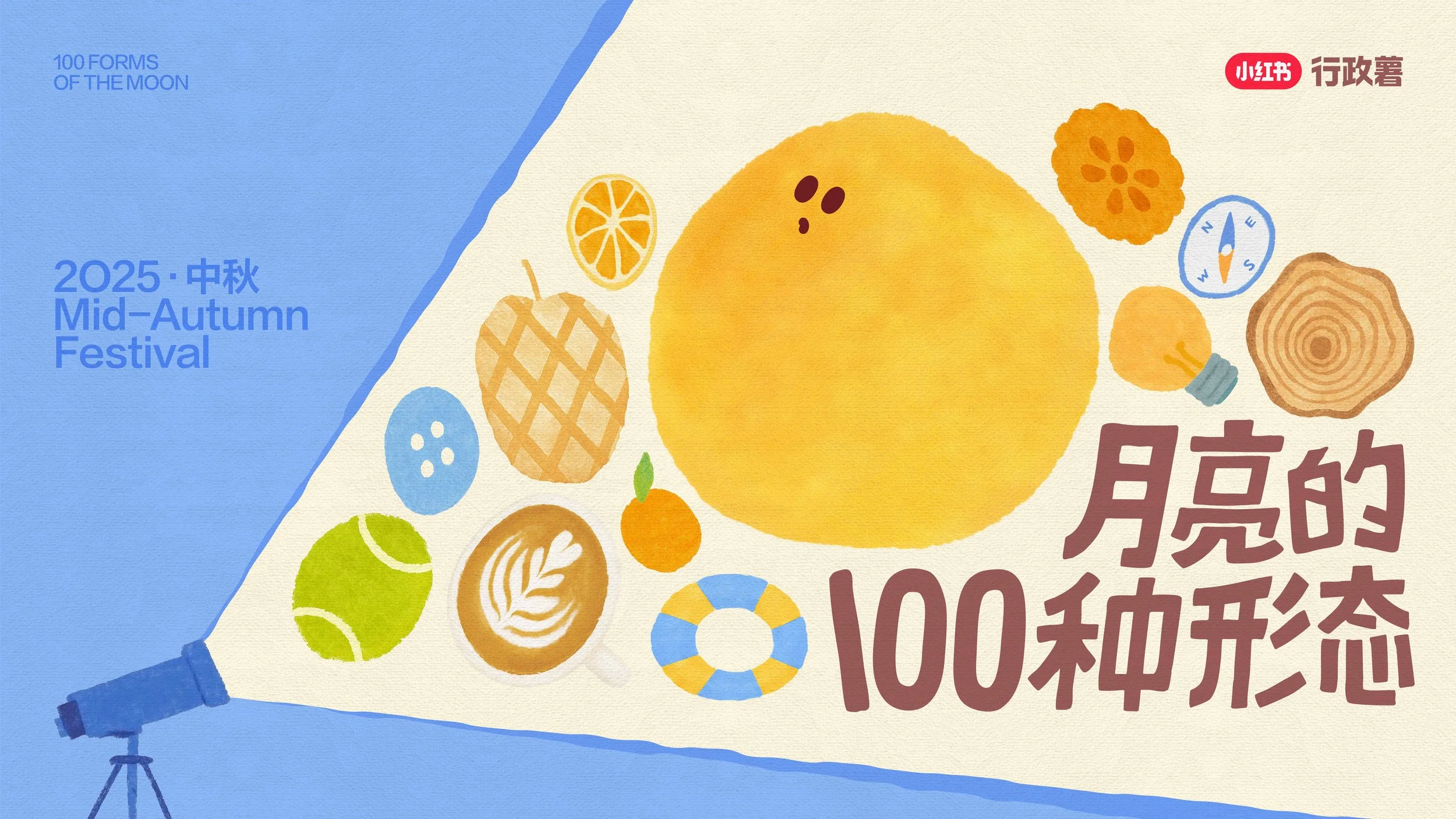
(1)S 级中秋活动「月亮的100种形态」的视觉设计;
(2)日常设计产出,包括海报及各类信息传播物料;
(3)主题会议室设计,探索办公空间中的视觉与体验应用。
这些作品共同构成了一次关于视觉系统如何在活动、传播与空间中延展的实践。
感谢您花时间预览这些作品。
I. Mid-Autumn Campaign
Key Visual by Xiaohongshu REDesign
-Statement-
This project presents the visual design work for Xiaohongshu’s S-tier Mid-Autumn campaign “100 Forms of the Moon.” I joined the project in September 2025, contributing to early-stage planning and visual requirement development, and was responsible for designing and extending selected key visual assets beyond the main key visual.
Building upon the existing key visual, visual elements were systematically deconstructed and reinterpreted to create a cohesive visual language. The design was applied across various online and offline touchpoints, including event signage, floor graphics, posters, and campaign merchandise (such as sleep masks and wearable items), achieving a seamless transition from concept to real-world implementation while maintaining visual consistency throughout.
本项目为小红书 S 级中秋活动「月亮的100种形态」中的视觉设计工作。本人于 2025 年 9 月参与该项目,参与活动前期策划及视觉需求梳理,并负责部分核心视觉内容的设计与延展(除主视觉 Key Visual 外)。
在既有主视觉的基础上,围绕品牌调性与活动主题,对视觉元素进行系统化拆解与重构,并应用于多类线上与线下场景中,包括活动板、地贴、海报以及系列活动周边(如眼罩、背带等),实现从视觉方案到实际落地的完整转化,确保整体视觉体验的统一性与延续性。
-Merchandise Design-
Coaster Design 杯垫设计
This set of coasters combines the “Captain” motif with the moon, developed in four variations. Distributed internally, with one set provided to each Xiaohongshu employee.
此套杯垫以“行政薯”与月亮元素相结合进行设计,共四款,作为活动周边在小红书内部发放,小红书全体员工人手一款。
Sleep Mask 眼罩设计
Designed as a campaign reward item and distributed as part of the event experience.
作为本次活动的奖励周边进行设计与发放。
Keychains & Fridge Magnets 钥匙扣& 冰箱贴 设计
Lure-inspired fish illustrations were developed into acrylic keychains and fridge magnets, translating Wang Mian’s personal interest in lure fishing into collectible merchandise. Created for the Mid-Autumn campaign “Celebrate Mid-Autumn with Wang Mian,” these items extend the festive experience into tangible takeaways.
以路亚拟饵造型为灵感的小鱼插画被延展为亚克力钥匙链与冰箱贴,将王勉对路亚钓鱼的个人兴趣转化为可收藏的周边产品。该系列围绕“王勉与你一起过中秋”扫楼活动设计,将节日体验延伸为可带走的实体纪念。
II. Posters & Banners & Package Design
-Details-
Visual Set B|Turnstile Graphics 闸机贴&挡板贴
The visual system was applied to turnstile graphics, integrating the campaign into everyday circulation paths and enhancing visibility within transitional spaces.
将统一视觉系统应用于闸机贴等通行空间中的视觉介入设计,强化活动在日常动线中的可见性与参与感。
Visual Set C|Wayfinding Stickers 指引贴
The visual system extends into spatial wayfinding applications, translating brand language into environmental graphics across multiple scales. From large-format elevator lobby installations to small directional stickers, the design guides audience flow while embedding campaign messaging within the physical space.
The large-scale elevator lobby graphics were implemented across three office locations in Beijing—Chengao 15A, Zhonghai A, and Zhonghai B—each tailored to its specific spatial context.
统一视觉系统被延展应用于不同尺度的空间导视设计中,包括电梯间的大型指引贴以及小型导向贴,用于传达活动信息并引导人流动线。从电梯间的大型指引装置到小型导向贴纸,设计在物理空间中引导观众动线的同时,嵌入并传达活动核心信息。
其中,大型电梯间指引贴分别落地于北京三个职场空间——城奥15A、中海A座及中海B座,并根据不同空间环境进行了针对性设计与适配。
-Final Installation-
Visual Set D|Experiential Touchpoints 体验与延展应用
The visual system extends into spatial and interactive applications, activating the campaign within everyday environments.
Mirror graphics were installed in restroom spaces to subtly introduce a Mid-Autumn atmosphere into daily moments. A limited-time photo booth with exclusive frames further encouraged audience participation and memory-making.
视觉系统进一步延展至空间与互动应用中,将活动融入日常环境之中。
镜面贴图设置于卫生间空间,在日常场景中嵌入中秋氛围;同时通过限时 Foto 机与专属相框设计,增强观众参与感与纪念体验。
Visual Set E|Poster & Print Assets (海报与信息物料)
The visual system was applied across a range of print assets, including posters and vouchers developed for different contexts. While maintaining a consistent visual language, content was adapted to suit specific communication needs. Selected examples are shown to represent the system’s scalability.
统一视觉系统被应用于多类平面信息物料中,包括活动海报与兑换券等不同载体。在保持整体视觉一致性的同时,根据具体传播内容进行适配与调整,此处选取代表性版本进行展示,以体现系统的延展性。
-Event Signage & Environmental Graphics-
Visual Set A|Event Signage & Interactive Visuals
The visual system was extended across event signage, floor graphics, and illustrated assets, integrating elements of the game’s naming and mechanics.
将统一视觉系统结合互动游戏的名称与玩法,应用于活动板、地贴及相关插画物料中。
III. Themed Meeting Rooms · Spatial Design
-Statement-
This section explores themed meeting room design within Xiaohongshu’s workplace environments, where each room is developed around a distinct concept and identity.
I worked on three themed meeting rooms—Altay and Jazz in the Beijing office, and Forest in the Wuhan office. For Altay and Jazz, I led the process end-to-end, including concept development, visual design, budgeting, sourcing, and on-site installation, ensuring the design was fully realized in the physical space. For Forest, I was responsible for the design proposal and cost planning, while the final execution was carried out by the local team.
本部分聚焦于小红书办公空间中的主题会议室设计,每个会议室均围绕特定主题进行视觉与空间表达。
我参与设计了三个主题会议室——北京职场的「阿勒泰」与「爵士」,以及武汉职场的「森林」。其中,「阿勒泰」与「爵士」由我从概念设计到最终落地全程跟进,涵盖方案设计、预算制定、物料采购及现场执行,确保设计在实际空间中的完整呈现;「森林」则由我完成设计方案与成本规划,最终落地由当地团队执行。
-Altay「阿勒泰」会议室-
Concept Statement
The Altay meeting room was developed around a brief that called for a departure from stereotypical grassland imagery, instead emphasizing a more refined ethnic aesthetic.
Drawing from research on nomadic culture in the Altay region—particularly Kazakh traditions—the design incorporates motifs and materials associated with pastoral life. Elements such as traditional patterns, wooden textures, a mounted deer head, and owl imagery were introduced to build a culturally grounded visual language.
The space was further enriched through locally sourced textiles, including carpets and felt crafts, alongside references to yurts and handmade objects. A dombra, a traditional Kazakh musical instrument, was also integrated as a key visual element, reinforcing the cultural narrative within the space.
阿勒泰会议室基于“避免草原刻板印象、强调民族风表达”的设计方向展开。
设计从阿勒泰地区的游牧文化出发,尤其参考哈萨克族的生活方式与视觉元素,提取并转化为具有空间表达的设计语言。整体融入了传统纹样、木质结构、鹿头装饰及猫头鹰等意象,构建出具有地域文化特征的视觉体系。
同时,通过引入当地采购的地毯与毛毡手工艺品,以及对毡房空间形态的借鉴,强化空间的真实感与文化氛围;并结合哈萨克传统乐器“冬不拉”的展示,使整体叙事更加完整。
-Renderings-
-Jazz「爵士」会议室-
Concept Statement
The Jazz meeting room was designed around a dark, warm-toned palette, primarily using black and brown to establish a moody and immersive atmosphere.
Centered on the visual language of vinyl records, the space incorporates key elements of jazz culture, including classic jazz posters, album covers, and instrument displays. Together, these elements create a layered environment that reflects the history and character of jazz music.
「爵士」会议室以黑棕色调为主,营造沉稳且具有氛围感的空间基调。
设计以黑胶唱片的视觉语言为核心,融入经典爵士海报、专辑封面及乐器展示等元素,共同构建出具有音乐文化质感的空间环境。
-Renderings-
-Final Installation-
- Forest「森林」会议室-
Concept Statement
The Forest meeting room was designed with a more refined and elevated approach, intended for frequent use by senior leadership.
The design adopts a restrained visual language, drawing inspiration from natural elements to create a calm and composed atmosphere. Through controlled use of materials, color, and spatial composition, the space balances subtle thematic expression with a sense of professionalism and hierarchy.
森林会议室在设计上强调更加克制与高级的表达,主要面向管理层使用场景。
整体以自然元素为灵感,采用相对收敛的视觉语言,营造沉静、稳重的空间氛围;通过对材质、色彩与空间关系的控制,在主题表达与专业感之间取得平衡。